Friday, January 24, 2014

I, Frankenstein

Those nice folks who cooked up the Underworld pictures have been busy. Brianchild of Underworld writer and actor Kevin Grevioux, this picture is based upon his I, Frankenstein graphic novel released just last October. Grevioux made enough money off the Underworld films to start his own comic book company, so he is keeping that part of the revenue, then sold the screen rights to his pals at Lakeshore Entertainment, co-finaciers of the Underworld films, and so on, and so on.  I suppose action figures are on the way.

When it came time for a director to be signed on, I presume they thought the script still needed work, because they got ahold of a pretty successful writer of this type of thing, Stuart Beattie, who has written the scripts for a couple of the Pirates of the Caribbean films, and for whom Frankenstein is his second directing job.

So while these are not the absolute best elements for quality picturemaking, I, Frankenstein turns out to be a rousing experience - if you go for this sort of thing.  I will give it this: You CAN follow it.

1. It seems that the Frankenstein (Aaron Eckhart) monster is immortal.  Why?  No idea.
2. It seems that Satan's Demon Naberius (Bill Nighy) wants to know how the Frankenstein monster was created from dead people.
3. Naberius has made a good hire: The brilliant bio-scientist Terra (Yvonne Strahovski), to carry on Dr. Frankenstein's work.
4. God's Angels (known as Gargoyles because they hang out in this enormous cathedral) are more-or-less lead by Leonore (Miranda Otto), who is trying to keep the Frankenstein monster (who she calls Adam) and his secrets out of Naberius' hands.
5. After some initial reservations, Adam joins the side of the Gargoyles, after he finds out what Naberius plans on doing with the power to re-animate the dead.
6. The Mormons will love it!

As with last week's Jack Ryan: Shadow Recruit, this attempt to breath new life into an old (public domain) classic is a double-edged sword: the emphasis must be on "new," and while there is much in I, Frankenstein that we have seen before, the dramatic shape of this story had me going along with it.  Maybe because I understood it - this helps.

But this method of coming up with a non-human enemy which you can show our Heroes slashing and hacking at without it being considered anything but "fantasy violence" IS beginning to get old.  The Demons, when hit over the head hard enough, turn into big, noisy fireballs, and disappear, just like that!  The Gargoyles, on the other hand, turn bright blue, and then vaporize and shoot up into the clouds (heavens?). Whatever.

We have seen the gorgeous, young, blond female scientist before too.   There is a scene where, after Adam saves Doktor Terra from an army of attacking Demons, the two repair to the most over art-directed filthy hotel room, where she proceeds to do minor surgery on one of his shoulders.  Adam is explaining to her for the first time the war between the Gargoyles and the Demons, and the entire big ugly picture.  Her instruments going into Adam's shoulder sound just exactly like what they probably were made by: moving a knife around in a jar of strawberry preserves on the foley stage.  She can't go on. The enormity of what Adam has told her is too much.  All I kept thinking about was: Would this woman REALLY operate on Adam in a room THIS filthy?  I don't think so.

Then too, there is Bill Nighy as the Big Bad Guy.  His role in the film, and the function he has in this story is so formulaic that one wishes there was some other way to do it.  And casting Bill Nighy isn't it.  I like him as a performer, and I resect him for it, but as the bad guy in a film like this - I don't think so.

Eckhart does what he can also.  But in turning the Frankenstein monster into a fairly good-looking fellow, the story has to focus on something else other than the monster's inability to play well with others.  He loses much of what makes him special, and becomes a mere participant in a larger story.  There is some interesting talk about the soul, and whether a re-animated body has a soul, and if not, why not and so on.  All of this intrigued me to the point where I felt as the though the picture was doing what a movie like this ought to do and rarely does: build up steam toward a big finish in the third act.

When we get our first glimpses of Naberius' plans, we don't see the half of it.  At the finale, the scale of his undertaking is revealed in all of its warped glory, and it is quite a sight.  I do not like to give away endings to stories here, so I will say that the dramatic shape of this story expanded considerably and with it, my interest increased accordingly.  I was really bowled over by the finish on this one.  It's wild-assed fun.

Meanwhile, I, Frankenstein is being shown in 1:1.85 in IMAX® theatres, while in non-IMAX® theatres, it is being shown in 'Scope!  We have not seen anything like this since the dawn of the widescreen age with the cropping of George Stevens' Shane!  Since when has a more narrow screen been considered the premium format?  Since when do the people in the less-expensive venues get the CinemaScope format?

Which feels like a bigger movie? 'Scope or. . .
. . . 1:1.85?
I have no idea how they have configured these two different versions, but I have to say that I feel that I have been done a disservice.  Soon, I suppose that all the IMAX® movies will be in 1:1.85, then we will wait for some crazy visionary to introduce a new version of Cinerama which will change the game again.  Perhaps the Chinese will have to convert to that, also.

Saturday, January 18, 2014

Jack Ryan: Shadow Recuit

Well folks, they have done it again. Paramount Pictures deemed that what we needed around here was a new series of Jack Ryan movies, and here it is, and it is actually pretty good.  Director Kenneth Branagh has been quoted as saying that it, "was the kind of film that I like to go and see."  We'll see if the market bears him out.

I like this sort of film as well.  A spy picture is perfect for films with their linear story lines, actors (and sometimes actresses) moving across the frame with a resolute step and clear intentions, crisp storytelling direction, along with advanced demonstrations of Griffith's cross-cutting technique.  Ryan is a marvelous example of how the Hollywood system can put together something so sharp and confident, even though the film had been in development hell for years.

Kenneth Branagh certainly knows how to deadpan.
Branagh certainly knows a lot about theatre and the movies.  This is the sort of movie where a sequence will open with a shot looking across Red Square in Moscow, and there will be a title in the corner that says "Moscow" and they move right on to other things, concentrating on the characters and their faces and their interactions, keeping the thing somewhat small and intimate.

In fact, I thought that the whole thing was being done somewhat on the cheap.  The downing of Ryan's helicopter in an Afghanistan war prelude was straight from Coppola's playbook: fast and confusing.  There is no big previsualized overdone long shot of the helicopter exploding.  You get the idea, then, it's off to Ryan being taken into a field hospital, bang.  Same thing with the sequence of Keira Knightly's Kathy being abducted.  Fast, tight, lots of shots, lots of confusion, over.

But the scale of the film changes once Ryan is recruited by Kevin Kostner's Harper character into the CIA, then sent to Moscow to infiltrate the doings of the Super Russian Bad Guy Cheverin, played by Mr. Branagh himself.

Of course, the bad guy in a picture like this has to be a formidable adversary.  The film's conception of international double-dealing and spy intrigue boils down to a personal grudge match between Cheverin and the CIA's invovlement in Afghanistan during the Soviet War in the 1980s.  These sorts of things certainly MUST be behind all of the economic turmoil we face these days, right? These story lines of the Evil Genius Who Wants to Destroy the World is getting harder and harder to sell to audiences.

So Cheverin is big, gruff, rich, has his own office tower where everything is black and so much slicker and intimidating than anything in America. He speaks in riddles, and like all bad guys, likes operatic music, paintings and literature; generally behaves like a brute.

On our side, we have Chris Pine as Jack Ryan, looking suitably rough, dashing or intelligent as the case requires, and Kevin Costner, looking quite rough and rumpled all the time.  Why should he worry? He has a two-picture deal.

In addition to the usual us-against-them, we have the contrast between the powerful black slickness of the Russians and their Land Rovers, and Our Guys, who are armed only with a bunch of over-designed laptops.

This works especially well in a variant on the Rear Window gambit: Have the CIA team watch as Ryan  sneaks into the bad guy's lair when we know Cheverin is otherwise engaged. Naturally, Cheverin, talking improbably with Keira Knightley about modern Russian literature, realizes that Ryan is breaking into his office, thereby endangering the girl, while Harper is guiding Ryan through his escape from the fortress - it's pretty good stuff. All the events flow reasonably one into the other, which is what makes me wonder: does life look like a spy movie to today's 20-year-olds?  Real life is a bit more chaotic. I wish for a few more screw-ups.

The outcome of all of this is never really in doubt. Despite some tense moments in the relationship between Ryan and his girlfriend Kathy, we know that they will be OK, that everything will work out in the end.  I also liked the scene in the CIA airplane flying back to the U.S.; Pine is enough of a smart fellow in real life to be able to pull off the gymnastic leaps of data gathering and logical conclusions demonstrated in this scene, but what I liked was Kathy's reaction to Jack's performance.  This is a side of her B.F. that she has never seen before.  Too bad this is a PG-13 movie (one "fuck" only, please), or else we should be seeing the aftermath: hot monkey sex all over the place. She likes this Jack Ryan better than the other one!

Too bad also that the finale to the picture is IN THE TRAILER!

I am pleased to report that this is a quite enjoyable film.  The spy picture has been a reliable genre for a while now, it will be interesting to see if modern audiences will respond to this mixture of Us vs. Them, Guys with guns and the Gals with innocent looks than Jack Ryan: Shadow Recruit provides.

Sunday, January 12, 2014

The Hobbit: The Desolation of Smaug

I will say this right upfront: the works of J.R.R. Tolkien are not my thing. I will respect the fact that Mr. Jackson's films of some of Tolkien's novels have struck a chord with people out there in Movieland, but I find the fascination puzzling nonetheless.

Having said that, I am all for anything which brings moviegoers in, seducing them into the pleasures of movie-going—whatever direction the medium is heading in.  The direction, for the present, seems to head toward what I like to call the "three-ring-circus" movie: these movies have indeed replaced the juggler, the lion-tamer, the bearded lady, and the midway.

The golden pile is almost as steep as stadium seating.
Last Christmas, my two houseguests (who were 18 and 23 or so) were free to pick the holiday movies we would go see. To my astonishment, they chose Django Unchained and The Hobbit: An Unexpected Journey. They both loved Django,  and completely ignored The Hobbit; I mean, a 6 minute sequence of two MOUNTAINS fighting?  Come on.  I suspect that there are more similarities between the two films than was apparent at the time, but for me, Django was more interesting in that it took place in a recognizable world.

Which leads me back to my starting point. I don't get the Tolkien thing, as translated by Peter Jackson and his WETA pals. Simply saying that one group, the Dwarves, need to reclaim their golden hoard, which had been stolen from them, hidden inside an impregnable mountain, and guarded by a fire-breathing dragon, does not suggest dramatic greatness. The reason for this is simple: we all know that in a story like this, the good guys will win. Not too many moviemakers will go, say, the Chinatown route, or The Treasure of the Sierra Madre or Psycho route, where your hero turns into somebody else and dies halfway through.

And this is what is at the heart of my own dissatisfaction with this sort of fantasy film. There is no dramatic content to it. I understand that it is ritual. I understand scale and pageantry. I like these things in movies. But nothing I saw in The Hobbit 2 was in any way relevant to the life I live. Perhaps modern viewers are OK with this, flocking to these admittedly visual experiences, which is what I find myself doing when the characters and story do not hold my attention: I look at the scenery.

The scenery is impressive. We visit a number of places over the course of the film, but I think Smaug's lair and the golden hoard inside the Lonely Mountain is the most interesting. In its Deco-with-Mayan styling, and relentlessly diagonal wash of golden treasure, it LOOKS like something ought to happen here, and it does. Up to a point.

For me, Hobbit 2 works best, when all the elements are working at the same level. The entrance of Bilbo in the interior of the Lonely Mountain is the most effective dramatic moment in the film.  We know that Bilbo is a much sterner fellow than the one we met at the beginning of the Hobbit story, but we also know that he is small, and weaponless; that the treasure is guarded by Smaug the dragon, and that the whole journey has centered on the need to find the Arkenstone (for whatever reason may be made clear later) thought to be within the pile of gold.

Martin Freeman could not have been a better choice to play this Bilbo Baggins character.  Many felt that the first Hobbit movie allowed for too much free reign for character-establishing foolishness and filler to make it hold our interest; an imbalance of too much character, not enough story. Perhaps Jackson was talking a longer view in that he knew that there would be less time to spend on scenes of actors inhabiting their characters in the second film.  Seen together, this might be the case.

In any event, Bilbo's entrance into the treasure area with Smaug's awakening, is very atmospheric and cinematic. It is the best example of everything working in the movie at the same level: story, performance, setting, tempo, and atmosphere.  But instead of simply eating Bilbo, like any talking dragon would do, turns out Smaug is a long-winded procrastinator, and the subsequent dialog goes on far too long, reducing what could have been a very promising sequence to overstay its welcome. This entire film is coated with bloat.

And the fans love it.

Some other quibbles. The Chinese is possibly the only theatre showing The Hobbit 2 in both IMAX® and "HFR." I did not see The Hobbit 1 at the Chinese last year, when they presented the movie in HFR also.  But the effect of shooting digital stereo images at 48 frames per second is that the image, though still film-like, seems more like it is shown on some sort of LED display, and gains a very noticeable video-like quality. Especially when there is fast movement. So now we have come full circle. The movies are mixed to sound good in our living rooms, and now, they look the same at the theatre as they do at home.  Total convergence.

I did not care for the sound mix for this movie either. Many lines of dialog (especially Smaug's) were simply unintelligible. I do not understand what it adds to a movie when dialog is so difficult to understand as it is here, but rather it shows a certain disregard for story and communication prevalent in this production.

Monday, November 4, 2013

Ender's Game: An IMAX Experience

Well, this is a surprise.  I saw Ender's Game on Friday, here it is Monday, and various parties are saying that, with a $25 million opening, it is a bomb already!

The movie gods giveth, and the movie gods taketh away.

I was quite dubious about Ender's Game going in: a mini-major trying to launch a new franchise, who spent over $100 million to make it, from a "cult" science fiction novel by Mr. Notoriously Picky Writer who is on as a producer (I guess being a producer makes him too busy to write his own novels anymore), a director I had never heard of, and a marketing campaign which didn't really tell you squat about what the film was about.

With all of this going for it, how could it miss?

But, after possibly the lamest narrated opening exposition ever, explaining the attack on Earth by an alien species (is there any other kind?), the film picked up considerably, and worked for me. Worked not without missteps, but it exhibited a strange combination of elements until it became its very own movie by the end.

"Dish here Batt'l School ain't big enuff for us bot - see?"
Certainly, Orson Scott Card's notion of training young video-gaming-addicted kids to fight our future battles for us against alien invaders, followed classic sci-fi practice: Find a trend in human behavior that you are not crazy about, and follow it to its furthest extent. From the perspective of 1985, this was eerily prescient. But from the perspective of 2013, it seems like a pandering attempt to capture back the Hogwart's crowd.

There are many interesting and new things going on in Gavin Hood's film, but some of them are undermined in strange ways: while I liked the family dynamic at the beginning, their video wall was straight out of the original Total Recall (1990). It was interesting to see all of the dynamics of the nameless zero-gravity laser-shooting game, but it had an annoying resemblance to the Quiddich game in the Harry Potter novels and films - and just as impossible for non-coms to understand. There was a strange pleasure in watching as a central character someone as young as Ender Wiggin, but the tired old method of having all the grown-up supervisors muttering "he's the one" had me shaking my head - we have seen much of this before.

So I think the filmmaker's had a tough proposition: tell the story contained in the first of the Ender novels, while trying to avoid many of what have by now become clichés in this genre. But the film impressed me by being able to take me there anyway, despite some of these objections which popped out from time to time.

Futurist films have better luck with me when they ground themselves in Earth's reality and history. At least Gravity (2013) takes place within the space program that we currently have, which makes it more compelling for me. Here, the attack on Earth by the Formics was made grim by having our forces battle the advanced aliens with fighter planes which closely resemble those we have today.  But after that, we have to project ourselves into an assembly of sometimes hard to swallow concepts, such as an international effort to protect Earth from future alien attacks and the ridiculously expensive Battle School to train the young'ns to do what the Old Farts can't.

But to place this defense in the hands of a rigorously trained super child - well THAT'S new.  But in order for a film such as this to work properly, there is a certain amount of fantasy-fulfillment that has to go on.  I don't know anyone who wants to be a hyper-computerized battle commander - do you? Throughout this film, there is really no one to cling to, although Viola Davis' character of Gwen Anderson might have supplied it if she had not been pushed out of the way.

Although I didn't really understand the object of the zero-gravity game, once Ender enters into the proceedings, his super-defensive impulses are depicted in the most gloriously liberating scene of gunplay since Kate Beckinsale shot herself a circular escape hatch in Underworld (2003). Ender has so much fun shooting and blasting people in this mock-battle that he is twirled about for us with both arms extended, firing away, and laughing in delight.  The filmmakers must have considered this an epiphany for Ender, and the high point of the film, because the musical score reaches its absolute zenith here. As David Byrne once observed, "People look silly when they are in ecstasy." If Ender is half-warrior and half empath, it is easy to see which half the filmmaker's choose to glorify so strongly.  The sound system at the Chinese has no ability to reproduce this overloud orchestra with sound effects with anything like fidelity.  I am sure it sounded great at Todd-AO, but here, at these levels, it's pretty shredded.

I enjoyed most of the performances, despite the underwriting of most of them.  The whole thing is very stylized and controlled.  There are no mistakes.  They show you only the things they want you to see.  No one forgets their car keys.  Asa Butterfield as Ender, is quite a performer, pulling out all the stops when he discovers that the Top Brass has treated him pretty much the same way as all the bullies in Battle School did. Harrison Ford rumbled his way through, but I was glad that his part was not just a walk on.  In order to subject Our Hero to the most humiliating hazing, we are introduced to the most extreme caricature of personal militarism in Bonzo Madrid, played here by Moisés Arias, who must be channeling Eddie Cantor's evil twin.  The film's precis of "The more you hate your enemy, the more you love them" seems sort of crazy, but gets its first demonstration after Bonzo decides to attack Ender at his most vulnerable: while taking a shower. Ender lashes out, and Bonzo falls, cracking his head open.

Ender's personality causes him to be extremely remorseful over this, which is kind of puzzling.  We hated Bonzo enough when he was attacking us, but now that he has suffered a cracked dome because of a flaw in his balance, we are suddenly all choked up?  Ender is the kind of person you would want as a benevolent dictator, but as we all know, being a dictator robs you of your humanity and your intellect.  Being a super-militarist robs of you of some of your humanity also. Ender's sympathy for the Formics is indeed uncharacteristic of someone with a military mindset, and this duality is where the film either captures you, or it looses you. I am not sure where it left me. When this film ends, it ENDS.

What I find interesting when I see films like this and others, like Prometheus (2012), is that these films reflect an interest we have in interplanetary exploration along with knowledge of the sciences, while at the same time, these very things are hideously low on our national or international agendas. The oft-encountered futurist vision of all the nations pulling together to Save Earth from Whatever, always strikes me as hopelessly idealistic, given our reactions to Earth's current problems.  But at least here, fighting an alien invasion, Earth's loss of 40 million people is supposedly enough of a hit to bind all the nations together to form a common defense.

So who knows?  I liked the strategy of leaving the depiction of the Formics to the end, which, without giving away the store, Our Hero Ender decides to empathize with, allowing the film to throw itself into a whole new direction.  I hope that they get to make some more of these films.

Just for the record, the Chinese was showing this film with the sidewall curtains closed, and no masking top and bottom.

Saturday, October 5, 2013

Gravity: An IMAX 3D Experience

I will join the chorus of approval for Gravity, a film which has a real buzz going for it. "Immersion" is a word you hear a lot around these IMAX / 3D films, and while that may be the new aesthetique du jour—take people someplace, anyplace—Gravity somehow has managed to be something that can only be communicated in the film form. How it got ground through two studios, various casts, and still found its singular greatness has to be attributable to the iron-clad will of director and co-scenarist Alphonso Cuarón.

The story of this film is so slight, that to speak about it at all almost requires giving the whole thing away, but Cuarón has fashioned a film so different from what we normally encounter at the movies today, a film which is both moderate in tempo and incredibly involving, allowing the viewer plenty of time and, uhh, space, to philosophically react to the events depicted.

And how this is done is especially interesting. I am sure that the first shot of Gravity will go down in history as one of film's most stunning achievements (if you exclude the opening of Robert Zemeckis' Contact [1997]). In what must be at least a 15 minute shot from on high looking down on Earth, all the players and the instruments and vehicles they are working on whirl into view. It is such an amazing ballet of images, performance, exposition, and staging, that it could only be accomplished by a director who has a genius for scene-setting.

I found it a very effective method to get all the techno-wonks (of whom a picture with a space theme would surely attract), to forget about "how did they do that?"; the shot goes on for so long that eventually, you find yourself forgetting all about how it must have been filmed, and when you are able to forget about how they did it, then you are able to actually be out there in space with the characters.

This is only the beginning.
During this long spacewalk outside the space shuttle Explorer, we are introduced to Sandra Bullock's character, Stone, who is trying to diagnose a troublesome faulty circuit board on the Hubble Space Telescope, while Clooney's character, Mission Commander Kowalski, is sort of skylarking around, assisted by a jetpack. They are both talking to Mission Control in that easy manner employed by people who must be very clear about what they say.

This tranquil atmosphere is broken when Mission Control informs them that debris from a detonated satellite is heading their way. And this is where I find that Cuarón's command of this film hits the ceiling - without really altering his staging technique of the first shot, the two astronauts find themselves having to pack it in, the telescope and the Explorer are destroyed, and our pair (focusing on Stone, who has no jetpack) are cast adrift in the immensity of space. The way that this sequence of events is depicted, with all of these huge objects whirling about the screen and exploding in silence is just stunningly viceral. Totally unique. And this is only the beginning.  There's more - lots more.

The space suits worn by both Bullock and Clooney somehow allow us to see them as people without our usual associations with them as movie stars. After Clooney does one of the most touching scenes I have ever seen him do, Bullock manages to get into the International Space Station, and it is here, after Stone has become a real person to us, we can really feel her release when she pulls off her space suit inside the station. We are with her as she curls into a fetal ball.

To say the this picture is a triumph for Sandra Bullock is something of an understatement. I am not sure she holds the picture together the same way Garland does in The Wizard of Oz (1939), but she comes close.  Unlike the actors in 2001: A Space Odyssey (1968), Cuarón wisely never allows the technical stuff to overtake Bullock, who is allowed to carry the picture. She even manages to hurdle over that bugaboo of all performers who are in a film where they are lost and on their own: talking to themselves. All filmmakers resort to this, but only really gifted actors can pull it off.

I am somewhat at a loss as to how to explain how the rest of the picture effected me. I will try. I found the whole thing done in a style that was for me the most elegant way of telling the story, revealing the characters, and showing the settings. While at the same time, I found my mind free to wander; not over  "How did they do THAT?" but over "how do I react when things go wrong?" or "Do I believe in an afterlife at all?" The room the picture has in it for the viewer to reflect, is what makes Gravity so much more than a mere sci-fi potboiler.

When you read a novel, your mind fills in the pictures, and this has always been literature's strength. In Gravity, there are actors, pictures, and sounds, but there is also you, your own mind. You are allowed to speculate, if you will, on your own life. I tell you, I had a very strange feeling upon re-entering my car down in the dim parking garage after the film. . .

Gravity reminds me of the great films where everything is working together on the same high level. Script, performance -  the scale of the piece, which contrasts the two characters with the huge environment they are in - the music, all of it is contributing to this theatrical effect that you can't get on a stage or in a book, or on television or a video game. It gracefully pulls you in, and you stay there.  It's incredible.

In more mundane matters, the Chinese is running this film on their 87 foot wide IMAX screen with no masking top and bottom.  Having studied the situation carefully, I am pleased to report that the screen is much more deeply curved than what was originally proposed in the plans presented to the public prior to the remodel. Screen curvature is measured by the "rise", which is the distance between the "chord" (a line drawn between the outer edges of the screen), and the center of the screen. At the Chinese, the "rise" is 9 feet, and thus, the aspect ratio of this space is 1:9.66, which is just slightly shallower than the original short-throw CinemaScope specs (usually somewhere around 1:9, 1:8). so the new IMAX screen is in approximately the same place with the same curvature as the older screen we all loved so much.

Gravity is the first modern film with a more-or-less conventional score to play the IMAX'ed Chinese, and I have to say that the Achilles heel of most theatre sound systems is present here: really thin sounding high strings.  High strings don't sound like that, fellahs.  The rest of the sound range thunders along most agreeably, with the sub-woofers doing a very creditable job of vibrating everyone without that false rattle that sounds so much like the old Sensurround speakers from Earthquake (1974). . . But massed strings, choirs, and pianos - tough things to reproduce, all. The Chinese is running Gravity with the sidewall curtains open throughout.

I attended the first show, hastily added on at 9:30 AM.  I was hungry, so I ordered a hot dog. The attendant said that the dogs were not ready, but that she would bring one to me when they were done.  She offered to walk me to my seat to find out where I was sitting, but I just gave her my seat number, and she brought it right in on a tray with condiment packets - very nice.

Anyway, Gravity is a great picture, and I hope it makes a lot of money, which hinges on whether people return to see it again.  I would.

Friday, September 27, 2013

Metallica: Through the Never: An IMAX 3D Experience

With Metallica: Through the Never: An IMAX 3D Experience, we have the very latest in vertical filmmaking: is it a film for the fans of the band or is it a film for everybody?

It is a difficult question to answer, and reviews of the film I have seen so far seem to take the tack of "If you like Metallica, you will love it, and if not. . . "  So I think that it is only fair to warn my readers that, before today, I doubt that I had ever heard a Metallica track.  I was sort of hoping that, somewhere along the way, a Metallica song had entered into the world-wide public's consciousness, and that I might say at some point in the film, "Ohh - I know THIS song," But that never happened.

During my long career as a film buff, I have sat through my share of rock concert films. But even as early as 1973's Yessongs, which clocked in at 76 minutes, had die-hard fans complaining that it was too long. The same must be said of 1976's Led Zeppelin's 137 minute The Song Remains the Same, which features a number of cut-aways from the arena action to give the proceedings some visual diversity.  Too long, everyone said. I have even seen 2008's Hanna Montana & Miley Ray Cyrus: Best of Both Worlds Concert (I got a note from my psychiatrist).

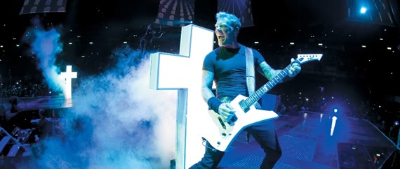
Metallica, from what I have been able to glean, is a heavy metal band which enjoys doing things somewhat differently, and their approach (aside from making a person wonder "why now?"), is, in some respects laudable. The concert sequences, shot in two Canadian cities in August of 2012, certainly make me nostalgic. "Oh, for the good old days of arena rock concerts!"  The footage is very impressive.  There is a huge stage, covered with LEDs, allowing video images to be displayed on the entire surface of the stage, which is surrounded on all sides by screaming fans.  But this is only the beginning. In the classic manner of stagecraft, more and more is added to this seemingly simple stage. Coffin-shaped video display units descend from the ceiling (which must contain the band's amps and speakers; there are none on the stage, while the musicians are on radio feeds, allowing them to wander at will across the playing area, while the drummer Lars Ulrich, more-or-less is contained on a revolving drum platform in the center); these coffins display images of dead people, who are being subjected to an unspecified physical torture.

After that, scrims are dropped all around the stage to present video images of World War One era soldiers marching off to their doom, followed by a very effective laser light and sound collage, recreating an aerial bombardment.  It is admittedly something which must be seen and heard to be believed. The bombardment is followed by a heavy construction crew assembling a huge stone statue of the blind Goddess of Justice, who looks rather like something Frank Frazetta by way of R. Crumb might have designed: thick, curvy, blonde, with boobs out to HERE.  As the band sings about whatnot, it proves that the blind Goddess is not constructed too well, and comes crashing down, with large sections narrowly missing the drummer's platform with stagehands running about trying to control the damage.  It also is very effective and spectacular.

And here is the heart of the matter.  At the arena concert shows, bands used to have the money to be able to commission wild, imaginative flights of fancy like these.  It is an elemental part of show business to blow a lot of money trying to make the fans enjoy what is presented.  People love seeing our most precious commodity - money - being spent to thrill a bunch of head-bangers.  As an objective observer, I think this filmed concert captures the theatricality just fine.  But what it also captures is the Metallica tribe itself.  The people for whom images and symbols of death and harshness signify a certain attitude, an attitude large groups of people have about their time here on earth.

It is a tribe of somewhat older, somewhat whiter, somewhat more male composition.  Not too many minorities up there at the Metallica concerts in Canada.  If Metallica satisfies their aesthetics, who am I to argue with it?

The IMAX 'Scope screen is 87 feet wide - I measured it!
Eventually, the dramatic arc swings toward a finale or sorts, as the band's set is plagued by a total breakdown of the stage equipment, with large lighting units tilting precariously, spraying sparks all over, flames shooting up from the stage, and all the scenery and props going haywire.  It is giddy fun, and the director has included shots of the young and the recently nubile enjoying this funhouse-mirror breakdown.  A man runs across the stage on fire, and paramedics are seen.  Long faces in conference are shown.  The music stops, the stage goes dark, and the band sets up some work lights The lead singer, James Hetfield, tells the audience that this now resembles the garage they used to practice in.  But then, a curious thing happens. I was wondering how they were going to get out of this atmosphere of disaster, with stagehands seemingly fried or crushed or whatever. Hetfield tells the crowd that "a couple guys" have been injured, but that they are going to be OK, so after a pow-wow, the band decides to keep on playing.

I did not get it.  Obviously, the show breakdown was intentional.  Fun, like I said.  This tribe seems to enjoy the idea of a total breakdown in our institutions.  The "injury" of the stagehands was something that might have been intentional, and if so, it is a theatrical device to just overlook it.  But if the injuries were not intentional, why leave it in the film?  People have suggested that I not over think this film, and this is surely a wise course to follow, but even still, this sort of stuck out. I guess I would have appreciated knowing what happened and why. Which leads us to the second point.

Through the Never departs from normal concert film form through the use of a story, enacted by a young man named Dane DeHaan, who plays a minor roadie for the band. His name, according to the PR handout, is Trip.  Trip is sent on an errand to get some gas to a truck associated with the band, broken down on a freeway somewhere. In the typical "quest" sort of storyline, Trip gets hit by a car, is stared at by an injured black man (was he in the accident also?) who runs off like a loon, is confronted by a gang of rioters, culminating in a confrontation with the Super Bad-Ass Riding a Horse.  All of this material is woven through the concert footage, at first only between songs, but as we get further along, a more integrated style is used.  The action in the Trip story probably is mirrored by the material the band is performing, but I am not familiar enough with the Metallica songbook to be able to report reliably on this.

This storyline was an interesting gambit, and although it ends on a distressingly ambiguous note, Trip's story seemed as though it was an attempt to make the film a bit more "with it" for the younger crowd. Trip is the youngest person in the picture. But what really happened to the stagehands?? Perhaps I have been watching too much reality television.

Which brings us to the sound work.  I was told going in that this film was LOUD.  I was also told that since this is the first real new digital everything IMAX film to play the Chinese, that IMAX techs have set the volume levels to their satisfaction. They were even okay with leaving the curtains between the side wall pillars open throughout the film.  But I have to say that the film is nowhere near the decibel levels one is subjected to at the real thing. A band like Metallica can easily afford a way more massive sound system on tour than any movie theatre can spring for. I remember 1992's IMAX documentary Fires of Kuwait, which depicted firefighters dealing with oil well fires as Iraqi was withdrawing from Kuwait in 1991. At the premiere in LA, there were a few firefighters who fought in these infernos.  I asked one of them if the sound of the flames from the oil heads was loud enough, and he said "This isn't even one tenth of how loud those were."

So I guess there is room for improvement in movie sound after all!

Monday, September 16, 2013

The Wizard of OZ: An IMAX 3D Experience

At yesterday's World Premiere at the Chinese of The Wizard of OZ: An IMAX 3D Experience, Oz Historian John Fricke, during his opening remarks, asked for the audience to indicate how many people had never seen the film.  Only a slight number of hands clapped. Then he asked, "How many of you have never seen Oz in a theatre?"  A much greater round of applause this time. And this is a shame. The trip to Oz is so much more interesting in a theatre for so many reasons.

And this lies at the heart of this new version of
Oz, which has been prepared for us to enjoy.

Most of us encounter the film, one way or another, on television, replete with commercials, interruptions, and everything else. I know I did.  The Yuletide tradition.

But then, there is encountering the film the way it was originally designed to be seen: in a theatrical setting, probably on a screen about 18 feet (or less) tall. And now, at the Chinese anyway, you have the film playing on a screen 46 feet tall and 61 feet wide, watching it from what you might consider to be a theatre balcony with no orchestra floor and shoved closer and lower to the screen: you are right there in the middle of it.

This is what the IMAX format was designed to do. Every IMAX theatre duplicates this approach. The large screen, the cliff of seats, the surround sound — it admittedly is very good at providing the viewer with an immersive experience. In fact, Oz was preceded with one of those short clips telling you about how great IMAX is — computerized space-graphics of chromed letters zooming and bobbing around, accompanied by sound effects meant to suggest speed and impact. All very calculated, all very dimensional.

And then, a strange thing happens. A slightly sculpted Leo the Lion shows up, then the credits roll for
Oz, and then into the opening of the film in sepia Kansas, and you know, the whole things looks very natural. The Wizard of Oz in 3D doesn't look in the slightest bit weird or strange at all.  I suspect that, since stereo photography had been around for a while even in 1939, whoever guided this 3D conversion had the taste and good sense to say to themselves, "If they had shot Oz in 3D back then, what would it have looked like?"

And this is what they have done. Provided you do not have the usual objections to 3D films, and that you do not suffer from the eye fatigue which so many people complain of, the experience of looking into the world created in the film becomes a really rather normal thing - you accept it right off. For a fellow such as myself, who has seen the film countless times theatrically, this is good news!

So that is out of the way.  The 3D is subtle and not overdone at all. Not even when they have a perfectly good opportunity, such as the shot looking up into the sky at the conclusion of the twister sequence, where the bottom of the house hurtles toward the camera — nope, they refrain from making that a "lookit everybody - duck!" moment.  That was not the point of the shot originally, so they hew to the through line they have set for themselves: don't be obvious.

The bigger issue (if you will pardon the pun) is that of the IMAX presentation. Since seeing the '59 Ben-Hur and Giant at the Chinese during the TCM Festival earlier this year, I have been musing on the subject of our spacial relationships to a screen.  Watching Ben-Hur on such a large screen provides you with a completely different relationship with the events presented, which had been staged counting on the fact you would be seeing it on a large screen in a theatre.


The aim of Hollywood during the 1930s was to make the sharpest, brightest color picture it was possible to make in 35mm (they tried 70mm, but it did not impress audiences at the time). Part of the visual design of
Oz is that, when the Tin Man is dancing, they simply provide him with a background that contrasts with his figure, set the camera at a good angle, and let him do his thing.  Stagey a bit, but appropriate for the moment. It was possible to get away with simple camera coverage like this for two reasons: first, the players on camera were, for the most part, seasoned vaudevillians, trained to perform. One did not have to cut to a new angle every second in order to hide the performer's lack of technique. And secondly, the image was so gorgeous to look at: sharp, colorful, a joy to behold.

When
Oz is enlarged to 46 feet tall, and one views it from the previously unimagined perspective of the IMAX bank of seats, a curious thing occurs, and it has nothing to do with sharpness. It has to do with the intimacy that has been gained. It seems strange to admit that a bigger screen would make for more intimacy, but it is true. All the old Hollywood directors liked the 1:1.33 frame, because it was so easy to compose close, intimate group scenes in the ratio. It is not surprising that the original 70mm IMAX was in this shape. The eye may reflexively sweep horizontally (hence widescreen), but that 1:1.33 image just fills your eyeline completely.

So much easier to compose groups in 1.33.
And so, the effect of stepping into the picture is greater.  I have noticed that with stadium seating, one tends to be less aware of the audience. Oz, I think, benefits from this to a degree, because it is a fantastical story happening to a young girl; when we do make the leap into the film's world, it is on a very personal level. Perhaps it is because we have all been introduced to Oz as children that does it.  We do not need an audience to enjoy it.

There are two scenes in
Oz that never fail to grip me by the throat, and they both have been intensified by the IMAX 3D treatment.  The first is the sequence where Dorothy returns to the farm with the twister and her being knocked out.  Let's just say that the threatening image of the cyclone in the background, ripping up the land, as the camera stealthily tracks along as Dorothy tries to get the storm cellar open - it's terrifying.  The new sound work here is simply shattering.  Like the 3D effects, it is not over the top, but it is loud, scary and rumbly.

The second is where, on the balloon podium, in a very close shot, Dorothy must say goodbye to her three friends, culminating in the best example of underwriting there has ever been: "I'm going to miss you most of all."  Just reading these words almost makes me weep. It is a very close composition, very tender and sincerely played by all the actors.

These moments are made all the more real because of their newfound depth and closeness.

The IMAX 3D version of
Oz gives us another way to see this most-cherished film, and I think that the way that they have done it is classy, respectful, and true to the spirit of the thing.  Let's hope they roll it out to IMAX theatres at Christmastime from here on.